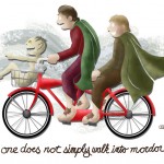
I came up with this idea awhile back and it went through some revisions before I decided to draw it. I first came up with the idea after reading the meme “One does not simply walk into Mordor” about 20,000 times before realizing that it’d be kind of funny to couple it with Rene Magritte’s The Treachery of Images. Initially, the writing was going to be in French until my girlfriend nixed the idea, saying the joke became a little too obscure at that point. It was a fun little piece that didn’t take too long and odds are that it will end up on a t-shirt for yours truly.
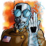
Hey, look! A superhero!
But this one is of my own creation. Convention season is coming and I’m going to spend a good portion of the summer promoting my comic, Variables (along with promoting my art in general). One of the steps of that process is creating promotional materials and, more specifically in this case, banners for my booth/table. The guy you see here is one of the main characters of the Variables universe, but… he has yet to appear. If I want to use this banner for more than one summer, he should really be on the banner. The only drawings I had of the character were not of high enough quality to put on a banner so I spent a day putting this together. It’s a simple portrait and took me five-ish hours to finish. I drew it large (I’m starting to really enjoy the leeway of working on a huge piece of bristol with a brush), brushed most of the inks, and then colored it in teh Photoshops. I’m very happy with the results.
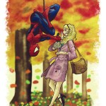
Gwen & Peter
This is my favorite piece in quite some time. With the new Amazing Spider-Man movie coming this summer, Gwen Stacy is going to be all the rage in the Spidey community. Gwen was killed in the comic book some time in the early 70s, I think. I didn’t know much about her until I was older and read some of the Spidey trade paperbacks that featured her death at the hands of the Green Goblin. Unlike the contemporary Mary Jane Watson, Gwen fascinated me because of her classic ties to Spidey, her always great 60s and 70s fashions (and hair), and because she died and never came back. That just doesn’t happen in comic books anymore and I think it’s been so long that any modern Spidey creator is too terrified to try to bring back such an iconic character.
But I’m sure the movie will change all of that as younger readers are exposed to the not-yet-trampled-to-death character of Gwen. This was done on 9×12″ bristol with Copic Multiliner markers and then colored (and aged) digitally. I may even like this one well enough to make it into a print.
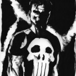
The Punisher
One of the things I’ve been practicing lately is loosening up my drawing style. I’ve been playing around with really loose large format ink pieces and this is the first that I’ve liked well enough to post. It’s of Frank Castle (the Punisher), one of my least favorite “superheroes” but one that’s pretty popular with the comics crowd. For a moody piece with a brush, I thought he’d be a great choice to give it a whirl. This piece is big, much bigger than it appears on screen. It was done with just one flat brush on 14×17″ bristol board. Not surprisingly, it took less than an hour to complete. Expect to see more of these coming in future weeks. Laying down big inks on this thing was a lot of fun. I’m tempted to try my hand at a Dr. Doom piece next.
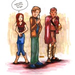
The Doctor, Amy, and Rory
Doctor Who is all the rage nowadays so I thought I’d take the time to give the latest trio a whirl. I’m playing around with different styles to find a few that I can rotate in and out of using whenever needed and this was a good opportunity to try a more cartoonish version of the regular comic book style I so often use in drawings of this sort. I like a lot of what is happening here but there’s definitely room for improvement, particularly in the mens’ faces. This piece also gave me the opportunity to use markers for coloring, a skill I still need to practice a lot before I will consider myself “good”. I’m building a portfolio for the upcoming con season so the more pieces I have in different styles, the better I’ll be able to sell commission work. So, expect to see more of these popping up before Memorial Day (roughly the weekend of my first convention).
I couldn’t resist putting a word bubble above Amy’s head because, frankly, she’s the most useless companion since the series restarted in 2005. She’s adorable but lacks the personality of Rose, the ass-kickingness (and smarts) of Martha, and the morality of Donna. She’s kind of a ditzy, empty vessel to up the show’s cute factor.
This was done on 9×12″ bristol board using Copic Multiliner inking pens and Copic/Prismacolor markers for color.
Time for a new icon
I first bought the Rocketpig.net domain in late 2001 and shortly thereafter, I drew the Rocketpig icon you see on the left. It was meant to be used as a forum icon, advertising, and general promotional work I’ve created over the years. It has served me well but it’s old and doesn’t represent the work I’m doing today. Hell, it hasn’t represented my work for at least half a decade but every time I tried to re-create a new icon, it failed. I’m still not sure this is the answer for the long-term but it’s much better than sticking with the old icon for one day longer. If nothing else, it’s a fun comparison to see what I was doing in 2002 versus what I created today.
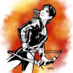
The girl who was on fire
In tribute of the Hunger Games movie releasing today, here’s a drawing of Katniss I put together last night. I’ve been in a rut drawing lately and lost my temper at this drawing a few times before finally getting this pose the way I wanted (I completely scrapped two drawings before this one). I like it, overall. She is striking her hero pose and the bow even looks like a reasonable facsimile of a real compound bow (if you’ve seen any bows I have drawn in the past, that absolutely was not the case).
That’s about all I have to say about this piece. It was done on 9×12″ bristol board with Copic Multiliner markers blah blah blah insert more things you don’t care about here. Now go see Hunger Games!
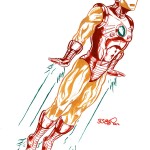
I am Iron MAN
This is something I’ve wanted to try for years but never got around to it until now with this retro Iron Man (I’ve always been fond of his second-generation armor from the late 60s-early 70s). I ordered a set of ten colored inks and decided to try to ink something using only colored inks. The results are a mixed bag, I think. The piece looks a lot cooler on paper than on-screen because, while it’s hard to see it here, the gold color is a metallic ink. I’ll probably play around with this a bit more but to use colored inks, I will have to limit my subject matter to (mostly) non-organic items. I don’t see this transitioning well to flesh-and-blood people/creatures. The piece was done on 14×17″ bristol board and inked with Speedball Calligraphy ink.
Beaker & Brush submission
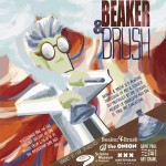
Normally, I stay away from spec work and crowd-sourcing “contests”. I think they trivialize the work of an experienced designer, making his/her time and experience valueless. The one exception is work for non-profit organizations. My girlfriend found this entry for Beaker & Brush discussions, a monthly meeting to discuss various topics in art and science. Initially, I was hesitant to enter because I didn’t have any good ideas right off the top of my head but after a few days, I thought it’d be fun to combine the science portion of the group through imagery and leave the art portion to be represented by the actual style of the piece done in an expressionist fashion (originally conceived from various European expressionist paintings with a spattering of 2D cubism thrown in for good measure). Overall, I think it works pretty well. Will I win? Oh, I doubt that. When it comes to art contests (particularly those that involve a close-knit art community), the “random stranger entry” rarely gets the nod. Still, it was a fun exercise done in a style I don’t often get to use.
Sci-Fi Girls Playing Cards
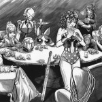
Every July in Minneapolis, there is a sci-fi convention called CONvergence. I’ve attended the past two years (my girlfriend and her friends run one of the main rooms) and this year, I saw that they wanted drawings of sci-fi based stuff for their souvenir book. It kinda fit perfectly with my goals of getting better at drawing mainstream licensed characters so I decided to give it a whirl. A couple of weekends and about 15 hours later, this was the result of my efforts. It’s pencils then full inks (like I use for my comic book) and then an ink wash over that. There are flaws here and there (a few pretty big ones like WW’s monstrous head) but overall, I’m pleased with it. It was a fun experiment to try but I’m glad it’s over and I’ll probably stick to smaller scale projects for awhile. This one took a lot out of me.
In case you can’t figure it out, these are the characters from left to right: Princess Leia from A New Hope, Samus Aran in her Zero Suit from Metroid, Connie From CONvergence, Blossom from the Powerpuff Girls, Wonder Woman from You Should Really Know Wonder Woman When You See Her, Hermione Granger from Harry Potter, and Starbuck from Battlestar Galactica.